Building blocks
スニペットとも呼ばれるビルディングブロックは、ユーザーがどのようにデザインし、レイアウトページを作成するかです。これらはデザインの重要な XML 要素です。
構成要素は2つのタイプに分類されます:
構造ブロック: "行全体"として視覚的に使用され、複数のカテゴリに分布します(Intro, Columns, Content, Images, People, etc)
内側コンテンツブロック: 他のビルディングブロック内で使用されます
この章の最後には、 :ref:`カスタム スニペット <website_themes/building_blocks/custom>を作成し、専用のカテゴリに追加することができます。
ファイル構造
レイアウトのファイル構造は次のとおりです。
views
├── snippets
│   └── options.xml
│   └── s_snippet_name.xml
スタイルのファイル構造は以下の通りです。
static
├── src
│   └── snippets
│       └── s_snippet_name
│           └── 000.js
│           └── 000.scss
│           └── 000.xml
│           └── options.js
デモページ
このページにアクセスするにはデモデータをインストールする必要があります:
https://your-database.com/website/demo/snippets
レイアウト
スニペットはウェブサイトビルダーを使用してユーザーが編集することができます。いくつかのBootstrapクラスは、いくつかのウェブサイトビルダーオプション**をトリガーするために重要です。
Wrapper
スニペットの標準的なメインコンテナは section です。 任意の section 要素は、移動や複製が可能なコンテンツのブロックのように編集できます。
<section class="s_snippet_name" data-name="..." data-snippet="...">
    <!-- Content -->
</section>
内側のコンテンツスニペットの場合は、他の任意の HTML タグを使用できます。
<div class="s_snippet_name" data-name="..." data-snippet="...">
    <!-- Content -->
</div>
属性 |
説明 |
|---|---|
クラス |
このスニペットのユニークなクラス名 |
データ名 |
右側のパネルにスニペットの名前として表示されます。見つからない場合は Block に戻ります。 |
data-snippet |
スニペットを識別するためにシステムによって使用 |
テンプレートの名前に基づいてドラッグ&ドロップすると、自動的に data-name と data-snippet 属性が追加されます。
警告
これらの属性は、テーマページでスニペットが宣言されるときに特に追加する必要があります。
警告
別の section タグの中に section タグを追加しないでください。これはウェブサイトビルダーのオプションの 2 回のトリガーになります。代わりに内側のコンテンツスニペットを使用できます。
ちなみに
静的ページの内容を標準的なスニペットで記述するには、次の2つの方法があります。
- ウェブサイトビルダーを使ってカスタム静的ページを事前に作成してください: スニペットをドラッグ&ドロップしてから
ファイルにコードをコピー/ペーストし、クリーンアップします。
- すべてのコードを直接書きましょう: Website Builderとの互換性に注意してください。
適切に動作するには、特定のクラス名、ID、データなどが必要です。 良い方法は、Odoo ソース・ファイルの標準コードで作成されたスニペットコードを探すことです。 ウェブサイトビルダーがページにドロップした後、スニペットにクラスを追加することがあることに注意してください。
要素
特定の CSS クラスを使用して、有効/無効にできる「機能」のリストがあります。
サイズ
`.row`要素から直接降下する大きなBootstrapカラム(Bootstrap構造を尊重している)は、Website Builderによってトリガーされ、サイズ変更が可能になります。
.row > .col-lg-*
列にパディングを追加し、`<section>`を追加します。
class="pt80 pb80"
注釈
pb* と pt* はハンドラを制御するために使用されるOdooクラスです。 値は multiple of 8 で、max of 256 (0, 8, 16, 24, 32, 40, 48...) まで増加します。
列セレクタを有効にします。
<div class="container s_allow_columns">
列の金額オプションを無効にします。
<div class="row s_nb_column_fixed">
すべての子列のサイズオプションを無効にします。
<div class="row s_col_no_resize">
特定の列のサイズオプションを無効にします。
<div class="col-lg-* s_col_no_resize">
色
カラムのカラーパレットと <section> に基づいて背景を追加します。
class="o_cc o_cc*"
すべての列の背景色オプションを無効にします。
<div class="row s_col_no_bgcolor">
特定の列の背景色オプションを無効にします。
<div class="col-lg-* s_col_no_bgcolor">
不透明度50%の黒いカラーフィルターを追加します。
<section>
    <div class="o_we_bg_filter bg-black-50"/>
    <div class="container">
        <!-- Content -->
    </div>
</section>
不透明度85%の白色フィルターを追加します。
<section>
    <div class="o_we_bg_filter bg-white-85"/>
    <div class="container">
        <!-- Content -->
    </div>
</section>
カスタムカラーフィルターを追加。
<section>
    <div class="o_we_bg_filter" style="background-color: rgba(39, 110, 114, 0.54) !important;"/>
    <div class="container">
        <!-- Content -->
    </div>
</section>
グラデーションのカスタムフィルタを追加します。
<section>
    <div class="o_we_bg_filter" style="background-image: linear-gradient(135deg, rgba(255, 204, 51, 0.5) 0%, rgba(226, 51, 255, 0.5) 100%) !important;"/>
    <div class="container">
        <!-- Content -->
    </div>
</section>
機能
編集不可能なエリア
要素を編集できないようにする。
<div class="o_not_editable">
要素を削除できないようにします。
<div class="oe_unremovable">
背景
背景画像を追加し、中心にします。
<div class="oe_img_bg o_bg_img_center" style="background-image: url('...')">
視差効果を追加する。
<section class="parallax s_parallax_is_fixed s_parallax_no_overflow_hidden" data-scroll-background-ratio="1">
    <span class="s_parallax_bg oe_img_bg o_bg_img_center" style="background-image: url('...'); background-position: 50% 75%;"/>
    <div class="container">
        <!-- Content -->
    </div>
</section>
注釈
セクションにビデオの背景を設定することができます。このドキュメントの「メディア」章を参照してください。
テキストのハイライト
テキストのハイライトは、特定の単語やフレーズに組み込んで強調できるSVGファイルです。 テキストのハイライトは、色と太さのためのカスタマイズ可能なオプションを提供します。

<h2>
   Title with
   <span class="o_text_highlight o_text_highlight_fill" style="--text-highlight-width: 10px !important; --text-highlight-color: #FFFF00;">
      <span class="o_text_highlight_item">
         highlighted text
         <svg fill="none" class="o_text_highlight_svg o_content_no_merge position-absolute overflow-visible top-0 start-0 w-100 h-100 pe-none">
            <!-- SVG path -->
         </svg>
      </span>
   </span>
</h2>
CSS custom property |
説明 |
|---|---|
|
SVG枠の太さ |
|
SVGオブジェクトの色 |
グリッドレイアウト
グリッドレイアウトは、CSSの強力で柔軟なレイアウトシステムで、複雑なビルディングブロックレイアウトを簡単に設計できます。
用途
row に o_grid_mode CSS クラスを追加することで、グリッドレイアウトを有効にします。 グリッドの行数は data-row-count 属性によって定義されます。 グリッドには常に12列が含まれています。style 属性で指定されたグリッドギャップは、行と列の間のギャップ(またはギャップ)を決定します。
<div class="row o_grid_mode" data-row-count="13" style="gap: 20px 10px">
   <!-- Content -->
</div>
グリッド内のアイテム
グリッドに`o_grid_item`クラスを使用してアイテムを追加します。グリッドアイテムに画像が含まれている場合は、`o_grid_item_image`クラスを使用します。
<div class="row o_grid_mode" data-row-count="13">
   <div class="o_grid_item g-height-* g-col-lg-*" style="grid-area: 2 / 1 / 7 / 8; z-index: 3;">
      <!-- Content -->
   </div>
   <div class="o_grid_item o_grid_item_image g-height-* g-col-lg-*" style="grid-area: 1 / 6 / 9 / 13; z-index: 2;">
      <img src="..." alt="..." >
   </div>
</div>
グリッドアイテムの寸法と位置は、z-indexとともに明示的に`style`属性で設定できるグリッド領域によって定義されます。
g-height-* と g-col-lg-* クラスは、Website Builder によって編集目的で生成されます。
Grid item padding
<div class="row o_grid_mode" data-row-count="13" style="gap: 20px 10px;">
   <div class="o_grid_item g-height-* g-col-lg-*" style="--grid-item-padding-y: 20px; --grid-item-padding-x: 15px; grid-area: 2 / 1 / 7 / 8; z-index: 3;">
      <!-- Content -->
   </div>
</div>
CSS custom property |
説明 |
|---|---|
|
垂直パディング (Y軸) |
|
水平パディング (X 軸) |
互換システム
- スニペットに`data-vcss`、
data-vjs、および/または`data-vxml`属性がある場合、それが更新されたことを意味します。 バージョンは元のバージョンではなく
<section class="s_snippet_name" data-vcss="001" data-vxml="001" data-js="001">
    <!-- Content -->
</section>
これらのデータ属性は、そのスニペットに対してどのファイルバージョンをロードするかをシステムに示します (例: 001.js、 002.scss)。
カスタムスニペット
いくつかのより具体的なニーズは、カスタムスニペットの作成を必要とします。ここでは、カスタムスニペットを作成する方法です/
テンプレート
スニペットテンプレートを最初に作成します。その後、リストに追加し、ウェブサイトビルダーで利用できるようにします。
1. 宣言
まず、カスタムスニペットのテンプレートを作成します。
/website_airproof/views/snippets/s_airproof_snippet.xml¶<?xml version="1.0" encoding="utf-8"?>
<odoo>
<template id="s_airproof_snippet" name="...">
<section class="s_airproof_snippet">
<!-- Content -->
</section>
</template>
</odoo>
警告
data-name と data-snippet 属性は、テーマページでスニペットが宣言されるときに指定する必要があります。 そうしないと、スニペットはウェブサイトビルダーによって認識されず、データベースのアップグレードが行われるたびに問題が発生する可能性があります。 更に、name 属性はオプションパネルの Blocks セクションにカスタムスニペットの名前として表示されていることを覚えておいてください。
ちなみに
可能な限りBootstrapネイティブクラスを使用してください。
すべてのカスタムクラスをプレフィックスします。
.x_nav,.x_nav_itemなどのクラスに小文字のアンダースコア表記を使用します。複数のスニペットがページ中に表示されるので、`section`内でID属性を使用しないでください(ID属性はページ上で一意でなければなりません)。
カスタム スニペットを標準スニペットのリストに追加します。 ユーザーは編集パネルから直接ページにドラッグ&ドロップできます
2. グループの作成
リストの一番上にグループを追加します。(このリストに必要な場所に配置してください)
/website_airproof/views/snippets/options.xml¶<template id="snippets" inherit_id="website.snippets" name="Airproof - Snippets">
<!-- Create the group -->
<xpath expr="//snippets[@id='snippet_groups']/*[1]" position="before">
<t snippet-group="airproof" t-snippet="website.s_snippet_group" string="Airproof" t-thumbnail="/website_airproof/static/src/img/wbuilder/s_airproof_group_thumbnail.svg"/>
</xpath>
</template>
属性 |
説明 |
|---|---|
スニペットグループ |
グループの ID |
t-snippet |
継承テンプレートID |
文字列 |
ユーザーに表示されるグループ名 |
t-thumbnail |
グループのサムネイルへのパス |
3. スニペットの追加
Then add the custom snippet into the <snippets id="snippet_structure"> which contains
all existing ones on the same level. The Website Builder will split them automatically into
categories by reading the group attribute on the <t t-snippet="">
/website_airproof/views/snippets/options.xml¶<template id="snippets" inherit_id="website.snippets" name="Airproof - Snippets">
<!-- Create the group -->
<xpath expr="//snippets[@id='snippet_groups']/*[1]" position="before">
<t snippet-group="airproof" t-snippet="website.s_snippet_group" string="Airproof" t-thumbnail="/website_airproof/static/src/img/wbuilder/s_airproof_group_thumbnail.svg"/>
</xpath>
<!-- Add the custom snippet to the group -->
<xpath expr="//snippets[@id='snippet_structure']/*[1]" position="before">
<t t-snippet="website_airproof.s_airproof_snippet" string="Custom snippet" group="airproof">
<keywords>Snippet</keywords>
</t>
</xpath>
</template>
属性 |
説明 |
|---|---|
t-snippet |
使用するスニペットテンプレート |
グループ |
スニペットが追加されたグループ。 |
<keywords> |
スニペットパネルの検索フィールドにユーザーが入力したキーワード |
内容スニペット(内容)
Inner content リストにカスタムスニペットが表示されるようにするには、代わりに snippet_content に追加します。
/website_airproof/views/snippets/options.xml¶<template id="snippets" inherit_id="website.snippets" name="Airproof - Snippets">
<!-- Add the custom snippet to the group -->
<xpath expr="//snippets[@id='snippet_content']/*[1]" position="before">
<t t-snippet="website_airproof.s_airproof_snippet" string="Custom snippet" t-thumbnail="/website_airproof/static/src/img/wbuilder/s_airproof_snippet.svg" />
</xpath>
</template>
重要
ウェブサイトビルダーの右側のオプションパネルで直接利用できるので、
t-thumbnailを追加し、group属性を削除することを忘れないでください。:ref:`Inner content" スニペットを <website_themes/building_blocks/custom/options/inner_content> に追加することを忘れないでください。
オプション
オプションを使用すると、Website Builder を使用してスニペットの外観/動作を編集できます。 スニペットオプションを簡単に作成し、自動的にウェブサイトビルダーに追加できます。
関連項目
テンプレート
カスタムスニペットのオプションを設定するコマンドがたくさんあります。これらのオプションは /website_airproof/views/snippets/s_airproof_snippet.xml に作成できます。
/website_airproof/views/snippets/s_airproof_snippet.xml¶<template id="s_airproof_snippet_options" inherit_id="website.snippet_options" name="Airproof - Snippets Options">
<xpath expr="." position="inside">
<!-- Options -->
</xpath>
</template>
次に、使用可能なさまざまなオプションを挿入します。
/website_airproof/views/snippets/s_airproof_snippet.xml¶<template id="s_airproof_snippet_options" inherit_id="website.snippet_options" name="Airproof - Snippets Options">
<xpath expr="." position="inside">
<div data-selector=".s_airproof_snippet">
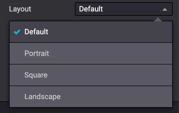
<we-select string="Layout">
<we-button data-select-class="">Default</we-button>
<we-button data-select-class="s_airproof_snippet_portrait">Portrait</we-button>
<we-button data-select-class="s_airproof_snippet_square">Square</we-button>
<we-button data-select-class="s_airproof_snippet_landscape">Landscape</we-button>
</we-select>
<we-title>Space</we-title>
<we-button-group string="Before">
<we-button data-select-class="mt-0">1</we-button>
<we-button data-select-class="mt-3">2</we-button>
<we-button data-select-class="mt-5">3</we-button>
</we-button-group>
</div>
</xpath>
</template>
内部コンテンツ
既存の内容のビルディングブロックを参照するすべてのCSSセレクタを含む変数`so_content_addition_selector`を拡張することで、カスタムスニペット「内部コンテンツ」を作成します。
/website_airproof/views/snippets/options.xml¶<template id="snippet_options" inherit_id="website.snippet_options" name="Airproof - Snippets Options">
<xpath expr="//t[@t-set='so_content_addition_selector']" position="after">
<t t-set="so_content_addition_selector"
t-value="so_content_addition_selector + ', .s_airproof_snippet'" />
</xpath>
</template>
関連項目
Odoo の GitHub リポジトリ <https://github.com/odoo/odoo/blob/cc05d9d50ac668eaa26363e1127f914897a4b125/addons/website/views/snippets/snippets.xml#L988>`_ の `Standard "inner content" スニペットの宣言
バインド
これらのオプションは、CSS セレクター(class、XMLタグ、idなど)を使用します。
データセレクター
オプションはグループでラップされます。グループには、含まれるオプションがユーザーインターフェイスとどのように相互作用するかを定義するプロパティを持つことができます。
data-selector は、セレクター値(CSS class, IDなど)に一致する特定の要素にグループに含まれるすべてのオプションをバインドします。 このオプションは、一致するセレクターが選択されると表示されます。
<div data-selector="section, h1, .custom_class, #custom_id">
data-target や data-exclude や data-apply-to のような他の属性と組み合わせて使用できます。
data-target
data-target="" は、 data-selector=char@@1 の子要素にオプションを適用することができます。
<div
   data-selector=".s_airproof_snippet"
   data-target=".row">
データを除外する
data-exclude="" で特定のセレクターをルールから除外できます。
<ul>`タグ(.navbar-nav`クラスなし)が選択されている場合、オプションが表示されます。¶<div
data-selector="ul"
data-exclude=".navbar-nav">
data-drop-in
data-drop-in はスニペットをドロップできる要素のリストを定義します。
<div data-selector=".s_airproof_snippet" data-drop-in=".x_custom_location">
data-drop-near
data-drop-near はスニペットを横にドロップできる要素のリストを定義します。
<div data-selector=".s_airproof_snippet_card" data-drop-near=".card">
data-js
data-js はカスタムJavaScriptメソッドを束縛します。
<div data-selector=".s_airproof_snippet" data-js="CustomMethodName">
レイアウト & フィールド
<we-title>
それらを分類するオプションの間にタイトルを追加します。
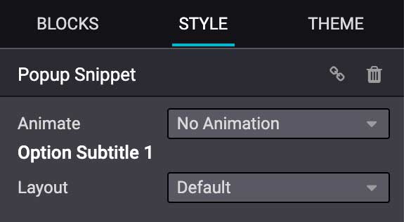
<we-title>Option subtitle 1</we-title>
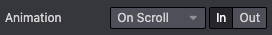
<we-row>
要素が隣接して表示される行を作成します。
<we-row string="My option">
   <we-select>...</we-select>
   <we-button-group>...</we-button-group>
</we-row>
このケースの完璧な例は、 Animation 行です。
<we-button>
このタグは、`<we-select>`と`<we-button-group> `の中で使用されます。
<we-button-group string="Before">
   <we-button data-select-class="mt-0">1</we-button>
   <we-button data-select-class="mt-3">2</we-button>
   <we-button data-select-class="mt-5">3</we-button>
</we-button-group>
この選択が選択されたときにターゲット要素に追加されるクラスを示すために、 data-select-class="" を追加します。 他の属性を XML ノードと同様に追加することで、スタイルやユーザーエクスペリエンスを向上させることができます。
<we-button
   class="fa fa-fw fa-angle-double-right"
   title="Move to last"
   data-position="last" />

<we-select>
オプションをドロップダウンリストとして書式設定します。フィールド名を指定するには string="" を追加します。
<we-select string="Layout">...</we-select>
<we-button-group>
オプションを隣接するボタンとして書式設定します。
<we-button-group string="Before">...</we-button-group>

<we-checkbox>
オプションをトグルスイッチとして書式設定します。
<we-checkbox
   string="Tooltip"
   data-select-class="s_airproof_snippet_tooltip" />

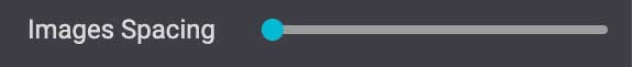
<we-range>
オプションをスライダーとして書式設定します。
<we-range
   string="Images Spacing"
   data-select-class="o_spc-none|o_spc-small|o_spc-medium|o_spc-big" />
範囲の各ステップは`|`で区切られています。ここでは、各クラス名はステップに対応します。
<we-input>
オプションをテキストフィールドとして書式設定します。
<we-input
   string="Speed"
   data-unit="s"
   data-save-unit="ms"
   data-step="0.1" />

<we-input> には、特定の場合に特に役立つオプションの属性が付属しています。
属性 |
説明 |
|---|---|
|
想定される測定単位を表示します。 |
|
ユーザーが入力した値を変換して保存する単位を設定します。 |
|
増分できる数値を設定します。 |
<we-colorpicker>
オプションを色/グラデーションとして書式設定します。
<we-colorpicker
   string="Color filter"
   data-select-style="true"
   data-css-property="background-color"
   data-color-prefix="bg-"
   data-apply-to=".s_map_color_filter" />

属性 |
説明 |
|---|---|
|
|
|
colorpicker が対象とする CSS プロパティを定義します。 |
|
返された CSS クラスに適用されるプレフィックスを定義します。 |
|
色を適用する要素を設定します。 |
メソッド
要素を選択、ターゲット、または除外できる*バインディングオプション*の他にも、オプションフィールドには標準的なJavaScriptメソッドを参照するいくつかの有用なデータ属性があります。
例えば、data-select-class は selectClass という名前のJavaScriptメソッドを参照します。
組み込みメソッド
選択
利用可能ないくつかの組み込みメソッドがあります。XMLテンプレートに直接関連データ属性を使用して呼び出すことができます。
データ属性 |
説明 |
|---|---|
|
オプションクラスセットで1つと1つだけクラスを選択し、関連するスニペットに設定します。 |
|
値を選択し、関連するスニペットに属性として設定します。属性名は |
|
値を選択し、関連するスニペットにプロパティとして設定します。属性名は |
|
値を選択し、関連付けられたスニペットに CSS スタイルとして設定できます。属性名は |
|
カラーパレットの選択を有効にします。**<we-colorpicker>` |
イベント
ウェブサイトビルダーがリッスンするイベントに直接リンクする組み込みメソッドもあります。
名前(name) |
説明 |
|---|---|
開始 |
編集セッションで初めてスニペットを選択した場合、またはページでスニペットをドラッグアンドドロップした場合に発生します。 |
破壊する |
パブリッシャーがページを保存した後に発生します。 |
onFocus |
スニペットがユーザーによって選択されている場合、またはページ上でスニペットがドラッグ&ドロップされている場合、スニペットが毎回発生します。 |
onBlur |
スニペットがフォーカスを失ったときに発生します。 |
onClone |
スニペットが複製された直後に発生します。 |
onRemove |
スニペットが削除される直前に発生します。 |
onBuilt |
スニペットがドロップゾーンにドラッグ&ドロップされた直後に発生します。このイベントがトリガーされると、コンテンツはページにすでに挿入されます。 |
cleanForSave |
パブリッシャーがページを保存する前に発生します。 |
カスタムメソッド
カスタムJavaScriptメソッドを作成するには、optionsグループとカスタムメソッドのリンクを作成する必要があります。 これを行うには、JavaScriptクラスを作成し、`data-js`でXMLテンプレート内で呼び出す必要があります。
オプション グループに data-js 属性を追加します。
<template id="s_airproof_snippet_options" inherit_id="website.snippet_options" name="Airproof - Snippets Options">
   <xpath expr="." position="inside">
      <div data-selector=".s_airproof_snippet" data-js="airproofSnippet">
         // Options
      </div>
   </xpath>
</template>
その後、クラスは JavaScript ファイルで作成できます:
/website_airproof/static/src/s_airproof_snippet/options.js¶/** @odoo-module */
import options from 'web_editor.snippets.options';
const AirproofSnippet = options.Class.extend({
// Built-in method example
start: function() {
//...
}
// Custom method example
customMethodName: function() {
//...
}
});
options.registry.AirproofSnippet = AirproofSnippet;
export default AirproofSnippet;
最後に、XML テンプレートを使用してカスタムオプションでカスタムメソッドを呼び出すことができます:
<template id="s_airproof_snippet_options" inherit_id="website.snippet_options" name="Airproof - Snippets Options">
   <xpath expr="." position="inside">
      <div data-selector=".s_airproof_snippet" data-js="airproofSnippet">
         <we-checkbox data-custom-method-name="" />
      </div>
   </xpath>
</template>
動的コンテンツテンプレート
デフォルトでは、Dynamic Content ブロックには、Website Builder で使用可能なテンプレートが選択されています。 また、テンプレート id 属性と同じ命名規則を使用することで、カスタムテンプレートをリストに自動的に追加することもできます。
テンプレートに電話する
選択された動的スニペットは、data-template-key とカスタム CSS クラスに基づいて適切なテンプレートによって`<div class="dynamic_snippet_template"/>`プレースホルダを置き換えます。
<section
   data-snippet="s_blog_posts"
   data-name="Blog Posts"
   class="s_blog_post_airproof s_dynamic_snippet_blog_posts s_blog_posts_effect_marley s_dynamic pb32 o_cc o_cc2 o_dynamic_empty"
   data-template-key="website_airproof.dynamic_filter_template_blog_post_airproof"
   data-filter-by-blog-id="-1"
   data-number-of-records="3"
   data-number-of-elements="3"
>
   <div class="container o_not_editable">
      <div class="css_non_editable_mode_hidden">
            <div class="missing_option_warning alert alert-info rounded-0 fade show d-none d-print-none">
               Your Dynamic Snippet will be displayed here... This message is displayed because you did not provided both a filter and a template to use.<br/>
            </div>
      </div>
      <div class="dynamic_snippet_template"/>
   </div>
</section>
例
/website_airproof/views/snippets/options.xml¶<template id="dynamic_filter_template_blog_post_airproof" name="...">
<div t-foreach="records" t-as="data" class="s_blog_posts_post">
<t t-set="record" t-value="data['_record']"/>
<!-- Content -->
</div>
</template>
属性 |
説明 |
|---|---|
ID |
テンプレートのID。`dynamic_filter_template_blog_post_`で始まる必要があります |
名前(name) |
テンプレートの読める名前 |
/website_airproof/views/snippets/options.xml¶<template id="dynamic_filter_template_product_product_airproof" name="...">
<t t-foreach="records" t-as="data" data-number-of-elements="4" data-number-of-elements-sm="1" data-number-of-elements-fetch="8">
<t t-set="record" t-value="data['_record']"/>
<!-- Content -->
</t>
</template>
属性 |
説明 |
|---|---|
ID |
テンプレートのID。`dynamic_filter_template_product_product_`で始まる必要があります |
名前(name) |
テンプレートの読める名前 |
data-number -of-elements(要素数) |
デスクトップのスライドあたりの製品数 |
data-number-of-elements-sm |
モバイルでのスライドあたりの製品数 |
data-number-of-elements-fetch |
取得した商品の合計 |
/website_airproof/views/snippets/options.xml¶<template id="dynamic_filter_template_event_event_airproof" name="...">
<div t-foreach="records" t-as="data" class="s_events_event">
<t t-set="record" t-value="data['_record']._set_tz_context()"/>
<!-- Content -->
</div>
</template>
属性 |
説明 |
|---|---|
ID |
テンプレートのID。`dynamic_filter_template_event_event_`で始まる必要があります |
名前(name) |
テンプレートの読める名前 |